

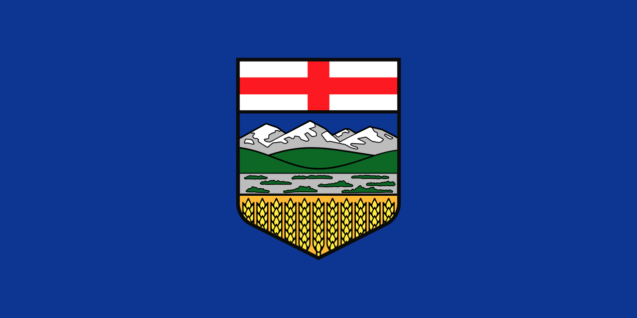
A royal warrant dated May 30, 1907 gave Alberta a shield, and on June 1, 1968 the province hung that shield on a blue field and called it a flag. Most Albertans could draw the result from memory. Fewer could say that the shield is built in five deliberate layers, or that the whole design reads as a map from the top down.
Key facts
- The King’s Printer of Alberta publishes the Flag Act, which came into force on June 1, 1968 and gave Alberta its flag.
- The shield at its centre was granted by royal warrant of King Edward VII on May 30, 1907.
- The shield spans seven elevenths of the flag width, and the flag runs at a ratio of one to two.
- Read from the top down, the shield shows a cross, mountains, foothills, prairie and a wheat field.
Alberta was late to having a flag at all. The province turned 63 before it adopted one, under the Flag Act that came into force on June 1, 1968. Until then the province had a coat of arms, a motto and no banner of its own.
The shield is older than the flag by 61 years
The centre of the flag is not a 1968 invention. It is the provincial shield, granted by royal warrant of King Edward VII on May 30, 1907, less than two years after Alberta became a province. The 1968 legislation simply took an emblem the province had been using for six decades and put it on a blue field.
The Act is specific in a way that legislation rarely is about anything visual. The shield sits centred and extends to seven elevenths of the width of the flag. The flag itself runs at a ratio of one to two. Somebody sat down and decided that seven elevenths was the right proportion, and nobody has changed it since.
Reading the shield from the top down
Start at the top and work down and the thing resolves into a picture of the land.
The first band is the red cross of Saint George on white, sitting across the chief of the shield. That is the inherited layer, the one that says where the institutions came from rather than where the ground is. It is also the layer most people forget is there.
Below it the Rocky Mountains, snow capped, running along the western edge of the province the way they do in life. Then the foothills in green, the belt of country between the range and the flat, which anybody who has driven Highway 22 knows is its own place and not a transition zone.
Then the prairie. Then, at the base, the wheat field.
Five layers, west to east, in the order you would actually encounter them coming down out of the pass. The design is a cross section of the province, and it puts the working land at the bottom holding everything else up.
What the flag chose not to include
What the shield left out says as much as what it holds.
It carries no derrick, no steer and no rail line, only terrain, so nothing on it could go out of date when the economy turned. Leduc was 40 years away, and the shield has not needed changing since.
Alberta settled on a picture of itself in 1907, put it on a blue field in 1968, and has left it alone through every boom and bust since.
Why any of this still matters
Flags do work that arguments cannot. They show up on trucks and front porches, and they carry an idea of a place without anyone having to defend it in a paragraph.
Alberta’s does something slightly unusual for a provincial flag. It skips the symbol and draws the province itself, in order, from the mountains to the crop. A visitor who had never been here could look at it and know roughly what the drive across looks like.
The flag belongs with other things Alberta made well. The Longview silversmith ended up on a national stamp, and the memory of King Ralph has outlived several policy agendas. It was built once, built properly, and then left alone.
Next time it goes up a pole, look at it from the top down. Cross, mountains, foothills, prairie, wheat. Somebody in 1907 got the order right.
Related from Alberta Tribune: The Alberta Flag Belongs To The People Who Built This Place