
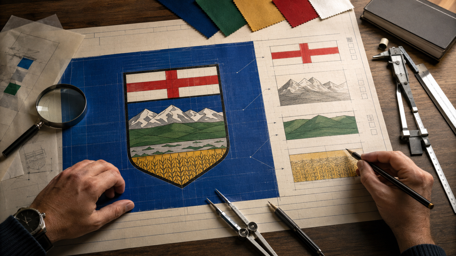
Lay it on the table, take out the instruments, and the most familiar object in the province turns out to be the most literal flag in the country.
Ten days ago, on the first of June, the Alberta flag turned 58. There was no cake. No proclamation. It spent the anniversary the way it spends every other day, hanging off school gyms and dealership poles and half the farmyards between Cardston and La Crete, so familiar that hardly anyone actually looks at it anymore.
So let’s look at it. Properly. Take it down, lay it flat on the kitchen table, put on the reading glasses, and go through it the way a scientist goes through a specimen. Layer by layer, with the lights on.
Because here is what the microscope reveals. Most flags are symbols. Ours is closer to a diagram. Alberta managed to put a working map of itself on a piece of fabric, and almost nobody noticed.
First, the Specimen
Start with the measurements, because this flag was written into law by people who liked measurements.
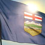
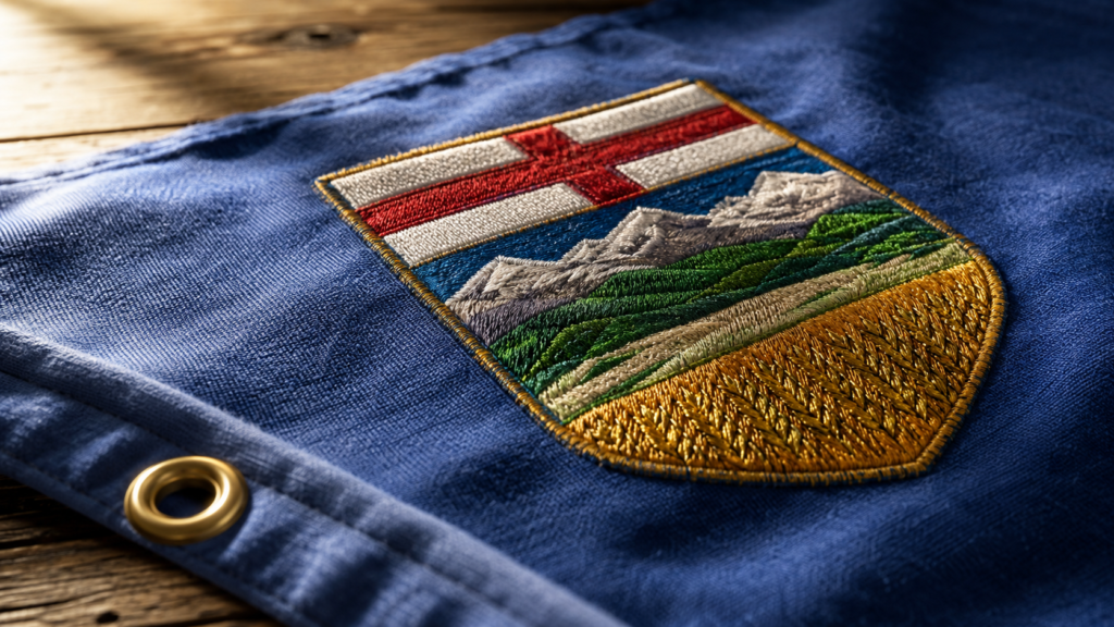
The flag was adopted on June 1, 1968, when the Flag Act came into force. It is twice as long as it is high. The field is royal ultramarine blue. Centred on that field sits the provincial shield, its height set at exactly seven elevenths of the height of the flag.
Seven elevenths. Not two thirds. Not three quarters. Whoever drafted that clause was a measurer, and honestly, that fits. This is a province that was ruled into townships and quarter sections before most of it had a single fence post. A people who navigate by range roads were never going to eyeball the shield placement.
The push for a flag started in November 1966, when petitions landed on Premier Ernest Manning’s desk asking for a banner of Alberta’s own ahead of Canada’s centennial. A design was approved as a provincial banner on January 17, 1967, flew through the centennial year, and was made the official flag by the legislature the following June.
Two other numbers matter. Alberta became a province on September 1, 1905, which means it went 63 years without a flag of its own. And the shield at the flag’s centre is older than the flag itself by six decades. The fabric is from 1968. The picture sewn onto it is from 1907.
The Blue Is Doing More Work Than You Think
The official term is royal ultramarine blue. Ask any kid in Vermilion or Vauxhall what it is and you will get a better answer. It’s the sky.
In 1984 the province made it formal and adopted blue and gold as Alberta’s official colours. Alberta blue, Alberta gold. Sky over wheat. The entire palette of this flag is the view from any range road in the third week of July, which is about as honest as government design ever gets.
And here is a detail the casual eye misses. The shield’s own background, the part behind the mountains, is also blue. So the flag is a blue sky carrying a small painting that contains another blue sky. The designers doubled down on the one thing this province has more of than anywhere else. Room overhead.
Reading the Shield Like a Core Sample
Geologists understand Alberta in layers. Drill down anywhere in this province and the core sample tells a story in strata, each band laid down in its own era, each one explaining the ones above it.
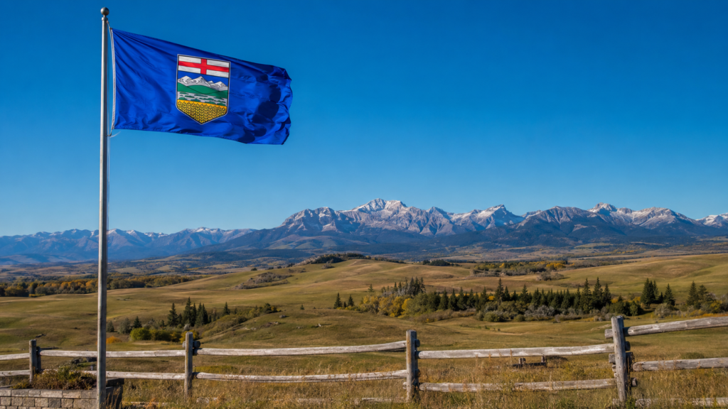
The shield works the same way. Read it top to bottom and you get five layers. A cross. Mountains. Foothills. Prairie. Wheat. It is a stratigraphic column you can run up a pole, and it doubles as a transect. Start at the British Columbia border and drive east on Highway 3 and you will pass through the bottom four layers in order. Rock, hill, grass, grain.
The 1907 grant describes the scene in the old heraldic language, with snow mountains standing behind a range of green hills and, at the base, “a wheat field surmounted by a prairie.” Heralds in London wrote those words for a province most of them would never see. They still got the geography right.
Now take the layers one at a time.
The Cross Up Top
The top band is a red St George’s Cross on white. It is the oldest layer and the only one you cannot see out a window.
King Edward VII granted the shield by royal warrant on May 30, 1907, when Alberta was not yet two years old. The cross carried English heraldic tradition onto the new province’s arms, and heraldry watchers have long read it as a nod to the arms of the Hudson’s Bay Company, the fur trade enterprise whose own cross-bearing shield stood over this territory for two centuries before Confederation reached it.
Call that layer the institutional bedrock. Every core sample has one. It is the stratum that says this place was chartered on paper, surveyed, and signed for before most of it was broken by a plough. You do not have to be sentimental about empire to appreciate the honesty of putting the paperwork right on the flag.
The Mountains
Below the cross, snow-capped peaks. The Rockies, drawn with the snow on, which is the only accurate way to draw them.
Their position at the top of the landscape is doing real structural work. The mountains are where Alberta’s water starts. Snowpack off those peaks feeds the Bow, the Oldman, the North Saskatchewan and the Athabasca, which means the peaks on the shield earn their placement. They are the water tower for everything painted below them, and for the millions of us living downstream.
Anyone who has driven west out of Calgary on a clear morning knows the moment the wall shows up on the horizon. The shield catches that exact view, the whole rampart rather than a postcard of one famous peak, the way you actually meet it.
The Foothills
Next band down, the green hills. Chinook country. The strip of ranchland that runs from the Porcupine Hills up past Cochrane, where the province changes its mind between rock and grass.
This is the layer most flags would have skipped. A lazier design goes straight from mountain to prairie. Whoever painted the original shield, a design long attributed to a Mrs. H. MacCully, understood that the foothills are their own country, with their own weather, their own grass and their own kind of people. Anybody who has wintered cattle west of Highway 22 can confirm all three.
The Prairie
Then the wide band. The prairie.
People from elsewhere call this part of the province empty. The people who live on it call it open, and the difference between those two words is the difference between visiting a place and belonging to it. This is the Alberta of Provost and Oyen and Milk River, where the horizon is a feature rather than an absence, and where you can watch weather arrive forty minutes before it gets to you.
On the shield, the prairie holds the middle. That feels right. It is the connective tissue of the province, the part that ties the ranch country to the grain country and carries the roads between them.
The Wheat at the Base
And at the bottom, gold. A field of wheat in head, ready for the combine.
In heraldry the base of a shield is the footing. It carries the load of everything above it, the way a foundation carries a wall. So read the composition the way its makers built it. The mountains may be the most beautiful thing on the shield, but the wheat is what holds the whole picture up.
In 1907 that was simply the truth. Agriculture was the bet the entire province was riding on. More than a century later the farm has company at the base of the real Alberta economy, but harvest still pays an enormous share of this province’s bills, still sets the rhythm of hundreds of towns, and still turns half the map gold every September. The footing held.
The Flag Scientists Have Notes
Yes, flag scientists exist. The field is called vexillology, and its practitioners have opinions about Alberta.
The five rules of flag design
The field’s standard pamphlet, Good Flag, Bad Flag, lays out five principles. Keep the design simple enough that a child can draw it from memory. Use meaningful symbolism. Stick to two or three basic colours. Put no lettering or seals on it. Be distinctive.
Measure Alberta’s flag against that list and it fails at least two tests outright. The shield uses six or seven colours depending on how you count the snow. No child is drawing those mountains from memory. And a detailed shield centred on a plain field is exactly the layout the design crowd files under the dismissive label of a shield on a bedsheet. When the North American Vexillological Association surveyed flag enthusiasts back in 2001, Alberta’s flag placed 35th out of the 72 provincial, state and territorial flags ranked. Mid pack. A solid C.
Here is where this column breaks with the lab.
The rules are right, and they are right about the wrong thing. Those five principles produce excellent logos. Abstraction, simplification, two flat colours, a shape you can sketch on a napkin. That is the correct recipe when a flag’s job is to be remembered.
Alberta’s flag has a different job. It keeps a record. The shield refuses to abstract the province, and that refusal is the whole point. You can test this flag against the actual landscape, peak by peak and band by band, which makes it something close to unique among flags. It is falsifiable. Drive the Cowboy Trail south on a clear day and check the data yourself. The mountains are where the flag says they are. The foothills roll exactly as drawn. The science holds.
A child cannot draw our flag from memory, granted. But a child standing in Pincher Creek can point at it. Not many provinces can claim that.
What the Flag Leaves in the Drawer
One more finding from the dissection. The flag is the stripped-down version of a much larger heraldic machine.
The full coat of arms grew in 1980, when the armorial bearings were augmented by royal warrant on July 30 of that year, in time for the province’s 75th anniversary. Above the shield went a beaver bearing the royal crown. Beside it, two supporters. A golden lion on one side, and on the other a pronghorn, the fastest land animal on this continent and a creature that still runs the grasslands east of Brooks. At their feet, a mound of wild roses, the provincial flower since 1930. And beneath it all, the motto. Fortis et Liber. Strong and free. The same words the national anthem saves for its biggest line, fixed here in Latin and meant as a job description.
Notice the casting choices. For its formal portrait, Alberta picked an animal with teeth, an animal with speed, and a flower with thorns. Make of that what you will.
The flag carries none of it. Just the shield on the blue. The full arms are the Sunday suit. The flag is the work clothes, and Alberta has always been more comfortable in the work clothes.
The Part No Microscope Finds
Every dissection reaches the limit of its instruments, and here is ours. Fabric, dye and heraldry explain what the flag shows. They cannot explain what it carries.
For that you have to track where the thing actually lives. On the gym wall in Camrose behind the volleyball banners. Over legion halls in Stettler and Grande Prairie. On the pole at the farm gate that gets replaced every couple of winters because the wind out here has no respect for heritage. In Lethbridge it lives sideways most of the year.
It has flown at half-mast over small towns on the worst day in their history, and it has flown over sandbag lines, fire camps and reopened main streets in years this province would rather not repeat. It gets handed to new Canadians at citizenship ceremonies in Edmonton and Calgary, folded small, and you will find it years later framed in living rooms beside family photos from three other countries. It rides in the back windows of trucks owned by people whose grandparents arrived with nothing, and in the back windows of trucks owned by people who arrived themselves in 2019.
A flag is a piece of cloth until people decide otherwise. Albertans decided a long time ago.
Sewing It Back Up
So the dissection ends the way the good ones do, with more respect for the specimen than you started with.
Fifty-eight years on, the flag holds up under the microscope precisely because it never tried to be clever. It is a window painted honestly, a core sample of home, a measured drawing of the only province whose flag you can verify through a windshield. The design experts gave it a C. The landscape gives it full marks.
Run it up the pole this summer and read it once, top to bottom, the way you would read anything worth reading. Cross, rock, hill, grass, grain. The whole story of this place in five layers.
Still accurate. Still flying. Still ours.